.png)


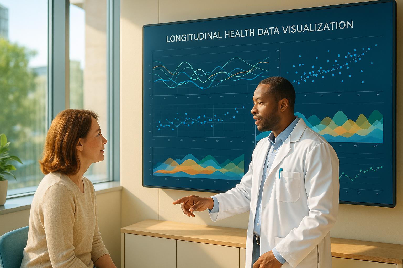
Longitudinal data visualization helps track changes over time, offering a clear way to analyze trends and patterns in healthcare. By using tools like line graphs, bar charts, and interactive dashboards, both patients and healthcare providers can better understand long-term health data. This approach is particularly useful for personalized medicine, early disease detection, and improving patient engagement. Technologies like wearables, electronic health records (EHRs), and AI-powered analytics play a major role in making this possible.
Key takeaways:
- What it is: Visualizing data over time to reveal trends and patterns.
- Why it matters: Improves health outcomes, supports personalized care, and aids early disease detection.
- How it works: Relies on tools like line graphs, dashboards, wearables, and EHRs.
- Future trends: AI, predictive analytics, and personalized dashboards are shaping the future of healthcare.
This guide explains how these techniques and tools are transforming healthcare, making data easier to interpret and act upon.
Introduction to longitudinal data: structure and visualisation
Core Benefits of Longitudinal Data Visualization
Longitudinal data visualization stands out as a game-changer in healthcare, offering tools that not only enhance patient outcomes but also reshape how care is delivered. By tracking health information over extended periods, these visualizations unlock insights that traditional one-time snapshots simply can't provide.
Personalized Medicine
One of the most impactful uses of longitudinal data visualization lies in its ability to support personalized medicine. Instead of applying one-size-fits-all treatments, healthcare providers can analyze patient-specific responses over time and tailor care plans accordingly. For instance, a study involving 7,000 participants found that adjusting drug doses based on pharmacogenetic testing significantly reduced side effects. These tools also help create integrated health profiles, revealing risk factors that contribute to the onset and progression of diseases. By monitoring conditions over time, providers can fine-tune treatments and implement timely interventions, leading to better disease management and improved outcomes.
Early Disease Detection and Management
Another critical advantage is the ability to detect and address health issues early. Longitudinal tracking uncovers patterns and trends that might otherwise go unnoticed, which is especially vital for managing chronic illnesses. For example, in one case, a review of a patient’s chart revealed a declining mean corpuscular volume (MCV) over two years, pointing to potential blood loss from colon cancer. This prompted timely alerts for healthcare providers. These tools also enable predictive analytics and clinical alerts, such as those integrated into electronic medical records. Studies show that even when working with incomplete or irregular clinical data, these methods improve the accuracy of early diagnoses and risk assessments.
Better Patient Engagement
Longitudinal data visualization isn't just for clinicians - it also empowers patients to take an active role in their health. By presenting clear, accessible views of health trends, these tools turn patients into engaged participants rather than passive recipients of care. At Beth Israel Deaconess Medical Center's Digital Clinic, patients using data visualizations with the mindLAMP app reported that the visuals helped them reflect on their health, validate emotions, and track progress and behaviors. As one clinician observed:
"In terms of patient care, [the visualizations have] brought new opportunities to notice different patterns as well as showing somebody's progression in treatment." - Clinician 1
These tools also address the widespread issue of low health literacy - estimated to affect 88% of the U.S. population. By making complex health information easier to understand, visualizations improve communication between patients and providers and support informed decision-making. Patients appreciate the clarity these tools bring to their care. As one study participant noted:
"I think it might give them greater clarity in terms of what they are dealing with and them being knowledgeable about what they are prescribing and which medications are likely to have greater side effects correlating to what you are reporting." - Phase II participant
Beyond enhancing understanding, these visualizations foster trust and transparency. They provide a tangible way for patients to see their progress, identify challenges, and feel empowered to share their data for even more personalized care. When paired with advanced monitoring technologies, these tools reinforce a data-driven, collaborative approach to healthcare.
Key Visualization Techniques and Tools
The way data is visualized can mean the difference between confusion and clarity. Effective visualization techniques turn raw information into insights that both patients and healthcare providers can act on. Building on earlier discussions about patient engagement, these tools simplify complex longitudinal data into visuals that are easy to understand. Since patients and providers often have different needs when interpreting health data, it’s vital to choose the right visualization method based on the audience and the type of information being shared. Let’s dive into some key visualization methods, starting with line graphs.
Line Graphs for Trend Analysis
Line graphs are a go-to option for tracking health metrics over time. They’re particularly useful for clinicians who need to identify trends, such as changes in blood pressure, glucose levels, or medication effectiveness over weeks, months, or even years. The continuous lines make it easy to spot patterns, like gradual increases, seasonal variations, or sudden changes that might require immediate attention.
While line graphs work well for healthcare professionals, they’re not always ideal for patients. Studies suggest that many patients find number lines and bar graphs easier to understand than line graphs. Platforms like MetforminDaily (https://metformindaily.com) have found that presenting data in simpler formats significantly improves patient engagement.
For line graphs aimed at healthcare providers, design choices matter. Use large fonts and clear color coding - like green for safe ranges, yellow for caution, and red for danger - to make the data instantly understandable.
Bar Graphs and Number Lines for Easy Reading
Bar graphs often outperform other visualization methods when it comes to patient comprehension. Research shows that most patients find bar graphs easier to read and interpret. Adding familiar elements, such as emojis, can make these graphs even more intuitive and engaging. This approach recognizes the diverse backgrounds of patients and underscores the importance of simplicity in design.
Number lines are another effective tool, especially for tracking progress toward health goals or illustrating pain scales. They provide a straightforward visual reference, often paired with simple labels like "did not bother me", "bothered me a little", and "bothered me a lot". These visuals are particularly helpful for patients who might not be accustomed to interpreting more complex data.
Interactive Dashboards
Static charts can only go so far. Interactive dashboards take data visualization to the next level by combining multiple chart types into dynamic, real-time insights. These tools pull data from various sources, allowing users to explore and interact with health information directly.
The healthcare analytics market is on a steep growth trajectory, projected to expand from $11.5 billion in 2019 to $40.8 billion by 2025. Hospitals that use data visualization tools have already reported impressive results, including a 15% drop in readmission rates and a 10% reduction in patient length of stay.
Here’s a quick comparison of leading platforms offering interactive dashboards:
| Platform | Best For | Starting Price | Key Feature |
|---|---|---|---|
| Power BI | Budget-friendly healthcare reporting | $10/user/month | Seamless integration with Microsoft tools |
| Tableau | Interactive visual dashboards | $70/user/month | Drag-and-drop dashboard creation |
| Qrvey | Embedded healthcare analytics | Custom pricing | No-code automation and multi-tenant setup |
To make the most of these dashboards, healthcare organizations should focus on features like seamless integration with electronic health records (EHRs) and patient portals. This ensures that both patients and providers can access visualizations without jumping between systems. Key capabilities to look for include multi-tenant architecture for managing data across multiple locations, automation tools for real-time updates, and AI-powered analytics for predicting patient risks and optimizing resources. Engaging end users during the design process is also crucial to balance technical sophistication with practical usability.
sbb-itb-cad6158
Best Practices for Effective Longitudinal Data Visualization
Creating impactful longitudinal data visualizations requires a careful balance of design, integration, and security. With healthcare data growing at an unprecedented pace, ensuring these elements work together is more important than ever.
Designing for Easy Access
Accessibility is the cornerstone of any effective visualization. The goal is to create displays that are user-friendly for everyone - from tech-savvy medical professionals to patients who may find complex data overwhelming - while maintaining the accuracy needed for critical decisions.
To achieve this, use clear visual hierarchies and intuitive color schemes, such as green for "safe", yellow for "caution", and red for "danger." However, don’t rely solely on color; incorporate labels or patterns to ensure users with color vision deficiencies can interpret the data effectively.
Consistency across platforms is another must. Standardized formats and terminology help patients feel more confident when navigating different health tools, especially when tracking intricate metrics like glucose levels or blood pressure over time. For instance, a patient who sees the same layout across multiple apps or portals is more likely to understand and trust their data.
Interestingly, research indicates that patients often prefer simpler visualizations, while healthcare providers are comfortable with more detailed views. Adaptive interfaces can bridge this gap by offering comprehensive clinical dashboards for providers and streamlined summaries for patients.
Once accessibility is addressed, the next step is integrating data from various sources into a cohesive view.
Combining Data from Multiple Sources
Healthcare data comes from a variety of channels - electronic health records (EHRs), wearable devices, mobile apps, lab results, and patient-reported outcomes. The real power of longitudinal visualization lies in bringing these disparate data streams together.
Standards like FHIR and HL7 make it possible to integrate data seamlessly. For example, glucose readings from wearables can be combined with medication records from EHRs and activity data from fitness trackers. With 96% of hospitals now using EHR systems, ensuring these connections work smoothly is crucial.
Integration isn’t just about technology - it’s also about timing and quality. Real-time data from wearables needs to align with periodic lab results and infrequent clinical visits. Visualization tools should clearly indicate when data was last updated and highlight any gaps. For instance, a diabetes management dashboard might combine continuous glucose readings, daily medication adherence, and quarterly HbA1c results. This approach gives users a clear picture of both short-term trends and long-term patterns without overwhelming them.
Once data integration is in place, protecting sensitive information becomes the next critical focus.
Protecting Patient Privacy
Healthcare data visualization operates in one of the most heavily regulated environments. Between 2009 and 2022, the HHS Office for Civil Rights documented 5,150 healthcare data breaches, affecting over 382 million records. In 2022 alone, an average of nearly two breaches involving 500 or more records occurred daily.
To safeguard this data, encryption is essential. Use AES encryption (128-, 192-, or 256-bit keys) to secure data both in transit and at rest. This protection should extend beyond databases to include the visualization tools themselves. Role-based access control is another critical measure, ensuring users only see the information they are authorized to access. For example, a nurse might view vital signs and medication schedules, while a billing specialist is limited to insurance and payment details - all derived from the same dataset.
When data is used for research or population health insights, anonymization and de-identification are key. Modern tools can strip or encrypt personal identifiers while retaining the data’s analytical value. This allows healthcare organizations to study trends without compromising individual privacy.
Accountability is equally important. Every instance of data access should be logged to detect breaches and demonstrate compliance during audits. Automated monitoring systems can flag suspicious activities, such as an unusual number of records being accessed or large datasets being exported. With the average cost of a healthcare data breach reaching $9.77 million in 2024, proactive monitoring is a smart investment.
Lastly, human factors play a significant role. Many breaches stem from human error rather than advanced hacking. Regular training on privacy best practices, incident response, and security awareness can prevent many issues. Intuitive tools that are both secure and easy to use further reduce the likelihood of accidental violations.
Future Trends in Longitudinal Data Visualization
Longitudinal data visualization is rapidly advancing, redefining how patient care is delivered through cutting-edge technology. These emerging trends are set to shape the future of healthcare in transformative ways.
AI and Predictive Analytics
Artificial intelligence is revolutionizing the ability to predict health outcomes using longitudinal data. For instance, AI models can now predict Alzheimer's disease up to six years before diagnosis with over 90% accuracy. This highlights how machine learning can uncover patterns that might be overlooked by traditional analysis.
But AI's potential doesn't stop at early detection. It also addresses long-standing biases in healthcare by accounting for factors like gender, race, ethnicity, and social circumstances such as education and income. In the case of chronic conditions like PCOS, studies using standardized diagnostic criteria have shown AI and machine learning (ML) achieving detection accuracies between 80% and 90%. Dr. Janet Hall, M.D., shared her perspective:
"Given the large burden of under- and mis-diagnosed PCOS in the community and its potentially serious outcomes, we wanted to identify the utility of AI/ML in the identification of patients that may be at risk for PCOS. The effectiveness of AI and machine learning in detecting PCOS was even more impressive than we had thought."
AI-powered Clinical Decision Support Systems (CDSS) are another game-changer, leveraging vast amounts of EHR data to improve healthcare delivery and enable more precise medical decisions. Deepthi Bathina, MBA, emphasizes the growing role of AI in healthcare:
"The time has come for us to think of AI as a collaborator. The role of AI is drastically changing.... The organizations who see that and embrace it are going to move forward faster, and the ones who still think of it as a tactical tool will pay for it."
This integration of AI into decision-making tools empowers both clinicians and patients, setting the stage for more personalized and user-friendly healthcare platforms.
Personalized Health Dashboards
The future of health dashboards lies in personalization. These platforms aim to consolidate data from wearables, EHRs, lab results, and patient-reported outcomes to create a detailed and tailored health overview for each individual.
Early implementations are already showing promising results. For example, patients using digital health tools reported a 40% improvement in managing their conditions. Additionally, the Mayo Clinic Patient Portal improved patient satisfaction scores by 25%, while continuous glucose monitoring systems led to a 10% improvement in HbA1c levels compared to traditional methods. These examples illustrate how personalized, real-time visualizations can directly enhance health outcomes.
Future dashboards will incorporate AI to adapt to individual patterns and preferences. Instead of generic metrics, these systems will highlight the most relevant trends for a patient’s unique health goals. They’ll also adjust how information is presented, ensuring it aligns with the user’s behavior and comprehension.
Such advancements will play a crucial role in managing chronic conditions.
Better Access for Chronic Conditions
Enhanced visualization tools are poised to transform how chronic diseases are managed. With nearly half of Americans living with chronic conditions - responsible for 41 million deaths annually - better access to these tools could have a profound impact on public health.
One key development is the rise of digital navigators. These tools act as intermediaries, helping patients and clinicians interpret complex visualizations in a way that’s clear and actionable. For conditions like diabetes and PCOS, platforms such as MetforminDaily are providing essential resources for education and self-management.
Wearable devices and mobile health apps are also making significant strides. These technologies enable dynamic health monitoring and provide real-time data to healthcare providers, allowing them to adjust treatment protocols promptly.
| Technology | Application | Impact |
|---|---|---|
| AI-powered analytics | Automates statistical model selection | Simplifies complex analyses for users with limited statistical expertise |
| Digital navigators | Help interpret visualizations | Ensure data is clear, relevant, and contextually accurate |
| Wearables and health apps | Monitor health in real time | Provide timely data for treatment adjustments |
The integration of these tools into healthcare systems is becoming more seamless and intuitive. Dr. Joe Kimura, MD, MPH, offers this advice:
"I'd say, start looking at patient information and how you're going to start structuring your system to handle that because it's coming."
As healthcare organizations prepare for these advancements, the focus is shifting from isolated tools to integrated ecosystems. This approach ensures that longitudinal data visualization becomes an essential component of both clinical care and patient self-management.
Conclusion
Longitudinal data visualization has become a key element in modern healthcare, offering immense potential to address critical challenges. Studies indicate that 30–40% of health conditions remain undiagnosed, but these tools can help uncover hidden issues before they escalate. For instance, one health plan reported a 75% boost in efficiency when updating code sets, along with a 90%+ reduction in processing time. Another organization achieved a 20–50% increase in chart review volume, demonstrating the tangible impact of these technologies.
Empowering patients is another major benefit. By visualizing health trends, tracking medication adherence, and monitoring treatment outcomes, individuals can take an active role in their care. This is particularly impactful for managing chronic conditions, where patient engagement often determines outcomes.
The combination of advanced visualization techniques and integrated data sources is revolutionizing patient care and provider workflows. The global healthcare data analytics market reflects this shift, with projections showing growth from $11.5 billion in 2019 to $40.8 billion by 2025. Over half of healthcare organizations worldwide are prioritizing data integration as a core investment. Adding AI, personalized health dashboards, and accessibility tools is set to amplify the effectiveness of longitudinal data visualization even further.
For those managing chronic conditions like diabetes or PCOS, platforms offering educational resources and self-management tools are becoming essential. This data-driven, patient-focused approach represents the future of healthcare. Organizations that adopt these innovations now are positioning themselves to deliver more personalized and efficient care in the years ahead.
The opportunity to reshape patient care is here, but the challenge lies in implementing these strategies quickly to benefit both patients and providers. For more information on harnessing data to transform healthcare, visit MetforminDaily.
FAQs
How does visualizing longitudinal data improve patient understanding and involvement in their health?
Visualizing longitudinal data transforms complex health information into clear, easy-to-understand visuals, helping patients better comprehend their health journey. By showing changes over time, these tools allow patients to spot patterns, track progress, and see how treatments or lifestyle adjustments are impacting their well-being.
This clarity encourages patients to engage more actively in their care. It also strengthens communication with healthcare providers, paving the way for better decision-making and stronger collaboration. When data is displayed in an intuitive way, it breaks down barriers in understanding, making healthcare more accessible and empowering for all.
What challenges do healthcare providers face when combining data from different sources for longitudinal visualization?
Healthcare providers face a range of obstacles when trying to combine data from different sources for long-term visualization. One of the biggest challenges is dealing with data silos - when information is locked away in separate systems, making it tough to access and integrate. On top of that, the lack of standardization in data formats often leads to inconsistencies, complicating the integration process.
Another pressing issue is ensuring data quality. Errors or incomplete records can result in misleading insights, which could affect decision-making. Providers also need to carefully navigate privacy regulations, balancing compliance with the need to protect sensitive patient information. Lastly, the sheer volume and variety of data, along with challenges like data latency, add another layer of complexity, slowing down efforts to create efficient and accurate visualizations.
How is AI shaping the future of longitudinal data visualization in personalized medicine and early disease detection?
AI is reshaping how we visualize longitudinal health data, making it easier and quicker to analyze intricate datasets like genetic profiles, clinical records, and biometric information. With this technology, healthcare providers can spot disease patterns early, assess risks, and design customized treatment plans that align with each patient’s unique needs.
By analyzing trends and detecting anomalies in real time, AI tools are boosting diagnostic accuracy and encouraging more proactive healthcare strategies. The result? Better patient outcomes and lower healthcare costs - a step toward a more efficient, patient-focused medical system.